 Previously I bloged about creative resumes, and that seems to be one of my highest hitting web pages, so in my shameless attempt to garner more hits, I’d thought I’d blog about creative v-cards as well.
Vcards are a fad that didn’t really catch on, think of them as virtual business cards (because that’s essentially what they are). So instead of handing out business cards, you hand out urls that point to this awesome looking page that has all your contact information. Since vcards are mostly used by freelance web designers, the designs of vcards are excellent, ranging from beautifully minimalistic to outrageously awesome.A good vcard design should answer 3 important questions,
Who am I?
Doesn’t need to be a picture, but your name and personality should shine through the design
What do I do?
We often assume people who get our business cards know what we do, sometimes they don’t and most of the time they’ve forgotten. If you’re a web designer or a programmer or a technical writer, make that clearly stated on your Vcard. Otherwise it’s just another contact form.
How do you contact me?
As much as we like posting our twitter and linkedin profiles, also include your email. Phone information is purely optional, but at least your email. A lot of people out there still don’t start contact via facebook or twitter. Good old fashion email is always the preferred option.
Here are some of my favorite vcard designs:
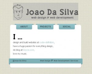
Nice design and clean layout. Jquery looks amazing, but Joao didn’t put his contact information on the card.
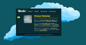
Beautifully done. Design is superb. The vcard answers all the 3 questions and is straight to the point. Well done Meelk!
Wonderfully simplistic. Answers all 3 questions. I wish I didn’t have to click the popups to see them though, but it does add to the feel of the site though.
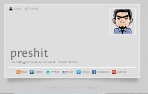
Great design, the personality comes out really well. However doesn’t answer the question of “What do I do?” well enough for me. Full marks for minimalistic design though.
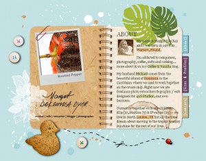
You don’t need me to tell you it’s beautiful design. I love it, and although I know she’s a photographer, I would have prefered she just kept photographer, rather than “mother|wife|retoucher|blogger|photographer”. That being said, I guess the personality does shine through the card amazingly well.
Excellent. Answers all 3 questions. Beautiful design, nuff said.
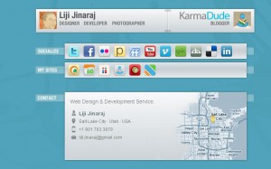
Has a section for each question, has beautifully designed contacts (pictured above) , great work.
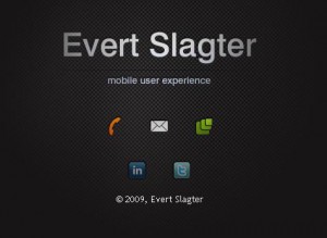
Evert has a great vcard. It starts out with the contact information, and then your eyes notice the words “mobile user experience” I guess the mystery of the vcard does have it’s advantages, but I’d prefer it to be clearer.
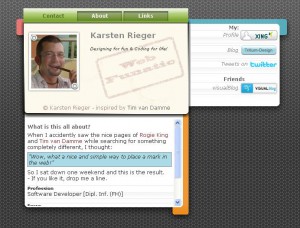
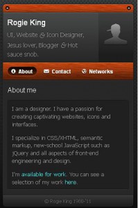
Once again, answers all 3 questions well. Who Rogie is and what personality he/she has just shines through, a section for the about me and contact. Great design.
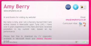
Amy’s colors are a bit too pastel for me, but she’s on the list as the only non web-designer or web-programmer. In fact Amy is a childcare worker from the UK and she not only has a contact information but beautifully designed resume icons that link to both the MS-DOC and PDF versions of her resume. Very VERY well done!! In my opinion, best of the lot, except that I wouldn’t color it pink. But that’s just me.
[…] a newer post about Creative Vcards that are equally inspiring. Share […]