Some companies re ceive so many resumes for each job application, they filter out applications based on your resume photo. Imagine, your resume was probably not read simply because your photo wasn’t eye-catching (imagine resumes like mine that have no photo!). It’s nobody’s fault, if you receive thousands upon thousands of resumes you need to have some filtering ability that doesn’t require time.
Obviously you shouldn’t be putting your photo on the resume, but the questions remains on how to get people looking at your resumes? The idea is to break away from the standard thinking that Resumes need to be linear. Microsoft word has far more capability now then when you wrote your first resume, and even then it’s better to use Adobe InDesign, Photoshop or even Scribus to create your resume. Resumes don’t need to be linear, but they need to be standard, it needs to have the standard information people are looking for and it needs to be presented clearly. A hiring manager isn’t bothered to look and search for your experience, it needs to be ‘presented’.
This post from Inc.com was excellent and has some rather cool links particularly to a great website called mostcreativeresumes.com
For more inspiration try this link, I personally think some people take this overboard ( like here). Recently Smashing magazine had a contest for creative resumes and some of the responses are pretty amazing, you can check them out here
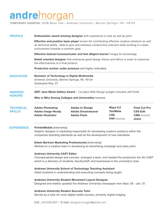
My personal favorite:

It’s clean, it’s intuitive, it’s one page and it’s minimal. All absolutely wonderful qualities of a great resume design.
Visit a newer post about Creative Vcards that are equally inspiring.
[…] I bloged about creative resumes, and that seems to be one of my highest hitting web pages, so in my shameless attempt to garner […]
[…] post like my post on creative resumes bring it lots of traffic (20-30%), some post […]
[…] 2nd most popular post of this blog is the one about creative resumes, which brings in about 300+ hits/month all on it’s own, almost all of it from Google. I guess […]
The reason why this works is because a truly creative resume will a) demonstrate your design skills and b) go viral, as the recipient excitedly shows off the amazing creation internally, selling your candidacy for you
Thanks Jacob,
but I was wondering whether you thought non-creatives could benefit from these out of the box resumes? Or would it hurt their chances?
Yes, absolutely. For non-creatives, the motivation is b) alone.
Companies want to hire people who get results, and in many cases it doesn’t matter where it was on their own or through an intermediary.
That’s a good point, but if I were to apply for a job as lawyer or banker or something completely ‘non-creative’ wouldn’t the creativeness get in the way, I believe it’s a great way to stand out, but sometimes the colors and themes, while nice and to provide a focus for the resume…distract a bit. Especially if you’re a traditionalist when it comes to resumes, and a lot of people are.
A creative resume design doesn’t need to be filled with colors or even images – Andre Morgan’s above would still look great in black & white – but it does need to know who its audience is. Only then can it surpass their expectations with something different than the other resumes they’re used to seeing.
Yeah, but I was wondering do you think non-creatives could benefit from these ‘out-of-the-box’ resumes