PSI vs. API, Malaysia vs. Singapore air quality readings
There’s been some controversy recently regarding the Air Pollutant Index (API) readings in Malaysia, with some even accusing the government of intentionally downplaying the readings.
I intended to find out exactly how the readings were different, and as a glorified techie come wannabe programmer I decide to use a data approach to this as opposed to a theoretical one. In case you’re wondering what the theoretical differences are, check out this cool article from cilisos, otherwise keep on reading.
At the crux of this issue, we first have to appreciate how API or PSI readings are calculated. Both take measurements of pollutants in the air, but only take the highest concentrated pollutant to give you the reading value. It’s hard trying to consolidate something as complex as air quality into a single number, and as a result a certain amount of ‘simplification’ is required.
Theoretically, PM2.5 measures particulate matter up to 2.5 micrometers in diameter, while PM10 measures particulate matter of up to 10 micrometers in diameter, the Singaporean Government claims that PM2.5 is the main pollutant of concern during periods of smoke haze, and hence you’d expect PM2.5 readings to be higher than Pm10.
But that’s theoretically, what about empirically?
The easiest way to determine if there is an empirical difference is to run readings in the same area of a period of time for PM2.5 and PM10 and measure the difference. However, I don’t have such an experiment setup, and so we take the next best thing.
Our lovely neighbours down south have been using Pm2.5 readings for quite some time (from April 1st 2014 to be exact), and our beloved DOE has been recording PM10 readings for an even longer period of time.
Fortunately, your friendly tech evangelist has already scrapped the DOE website for historical API readings, and I spent a good two hours yesterday scrapping Singapores PSI reading from their haze website as well.
Armed with these 2 datasets, I made a simple comparison between the API readings in Johor, specifically in Pasir Gudang, Larkin and Kota Tinggi, and the PSI readings in Singapore, specifically from the North, South, East, West and Central regions of the country.
[caption id=“attachment_5249” align=“aligncenter” width=“550”]
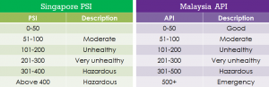
Image lazily copied from Cilisos.[/caption]
Because both governments offer the same advice, for the same level of PSI and API, stands to reason that there both readings should be similar, or at least in the same range.
So what does the data say. Well please be patient, because I want to be sure that the conclusions you make from this post are accurate, and hence I needed to make a control test. If I’m comparing Singapore to Johor, what’s to say two different areas can’t have vastly different API readings.
Although this isn’t very scientific, I decided to use two areas that I though were similar in size and distance as Singapore and Johor. So I grouped, Cheras, Batu Muda, Petaling Jaya and Shah Alam (what I called ‘inner-KL’), and Pelabuhan Klang, Banting and Putrajaya (what I called ‘outer-KL’). These two areas are almost an inverse of the geographic distances and size of Singapore and Johor.
[caption id=“attachment_5250” align=“aligncenter” width=“525”]
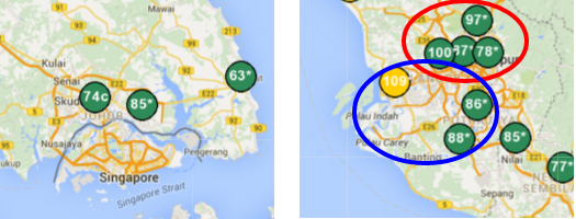
Picture Showing ‘Inner-KL’ in Red, and Outer-KL in Blue, and a scale map of Singapore and the measurement points for Johor[/caption]
Once all of that was settled, it was smooth sailing. Performing a few SQL queries on data, and cleaning up some blank measurements (btw, Singapore had just 50 missed measurements while Malaysia had 4909 over the 16 months in the dataset), I was able to get the average API/PSI reading per month for Singapore, Johor, Inner-KL and Outer-KL.
Then I did a quick analysis comparing the readings from Inner-KL to Outer-KL, to see just how big the difference between Johor and Singapore should be expected. As you can see from the spreadsheet below, the difference between inner and outer KL is quite negligible, sometimes Inner is higher than outer, sometimes it’s the other way around. Some months the difference is as high as 17%, but overall the average is just 5.2%. In other words, I should expect an average difference of 5.2% in the readings taken in Singapore and Johor as a baseline.
[caption id=“attachment_5261” align=“aligncenter” width=“512”]
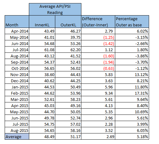
Comparison of API readings for InnerKL and OuterKL for the period Apr-2014 to Aug-2015[/caption]
But the numbers tell a different story, here is the difference between Johor and Singapore:
[caption id=“attachment_5260” align=“aligncenter” width=“543”]
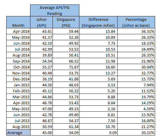
Comparison of API/PSI readings between Johor and Singapore[/caption]
As you can see, Singapore is ALWAYS higher than Johor, regardless of month or day. As expected theoretically, but now we have the concrete empirical data. But the question remains…by how much? Is is just 5% more, or much more? On average, Singapore’s PSI readings were 20% higher than Malaysia’s API reading. In other words, if the API reading was 200 in Malaysia, you’d expect it to be 240 in Singapore. Even if we account for a certain variability between regions (5% as we just established), there’s still a 15% differential between Singapore’s PSI readings and Malaysia’s API readings, that cannot be attributed to anything other than PM2.5 measurements.
Just to validate my claim, I looked at the daily average readings over the last 8 days, and found the difference to be even wider. Over the last 8 days, PSI readings in Singapore were (on average) 38% higher than Malaysian API readings, and on some days that number goes to as high 53%.
[caption id=“attachment_5262” align=“aligncenter” width=“537”]
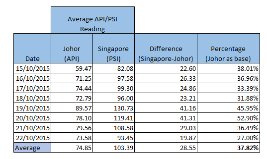
Comparison of API/PSI readings (daily average) between Johor and Singapore[/caption]
Just for completeness, I also did a comparison between InnerKL and OuterKL for the same period, and found the difference to grow to 10% (from just 5%), it appears than in times of Haze, the differences between regions (even those that are close by) can vary significantly.
[caption id=“attachment_5259” align=“aligncenter” width=“541”]
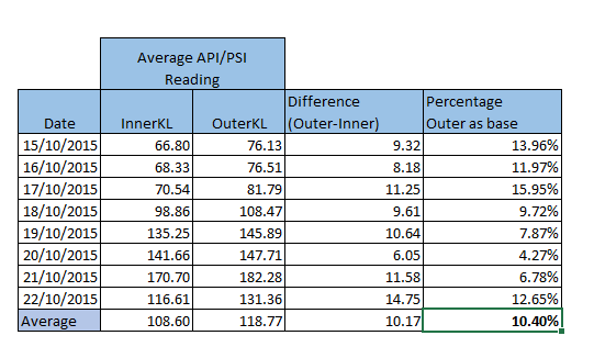
Comparison of API readings between InnerKL and OuterKL over last 8 days[/caption]
Conclusion
If you're living in Malaysia, and hoping for a proper PM2.5 reading, my advice is to write to your local MP and force them to bring this up in Parliament. Failing which, the best course of action would be to buy your own detectors.If you’re strapped for cash (like jobless ol’ me), and want a quick and dirty way to figure it out, just taking the API reading and adding 25% seems to be the best alternative.
Stay safe Malaysia.
This article was brought to you by a collection of fine particulate matter known as Keith. The full data-set with the latest data from Singapore has been uploaded here.
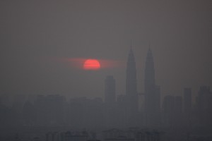
Picture of haze courtesy of Firdaus Latif : Link here.
Table of PSI/API copied from cilisos.my
All excel tables are my own, and published (as part of this entire blog), under creative commons 4.0, which basically means take it and do whatever you want with it for free.
Archived Comments